I was in the mood to update the design of uxHH.de
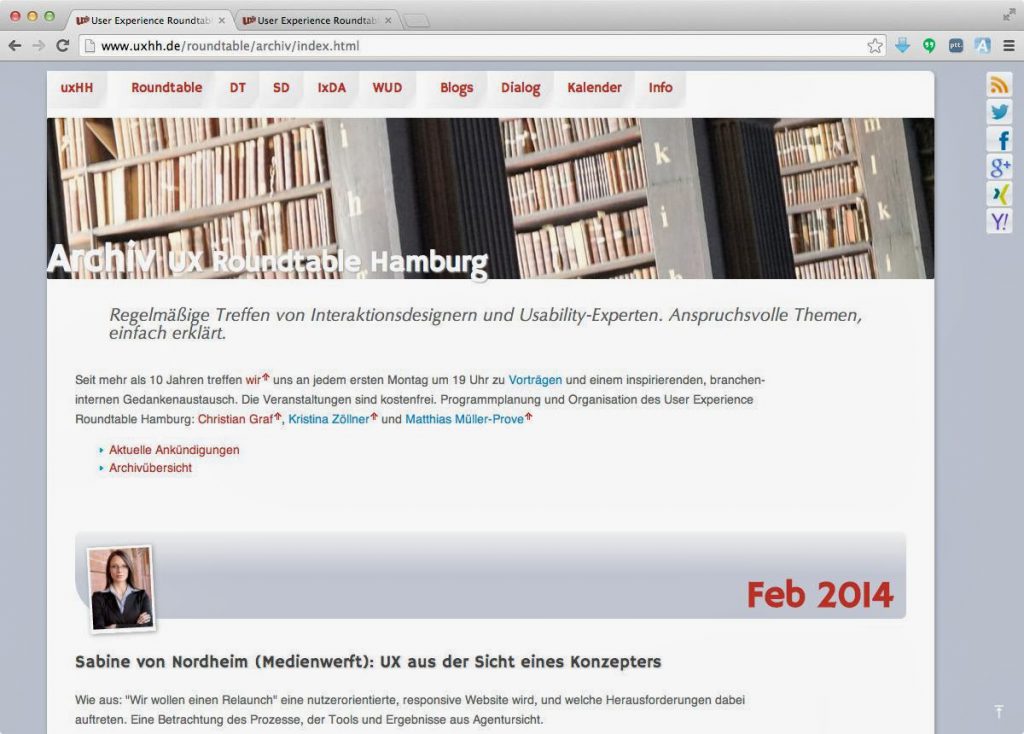
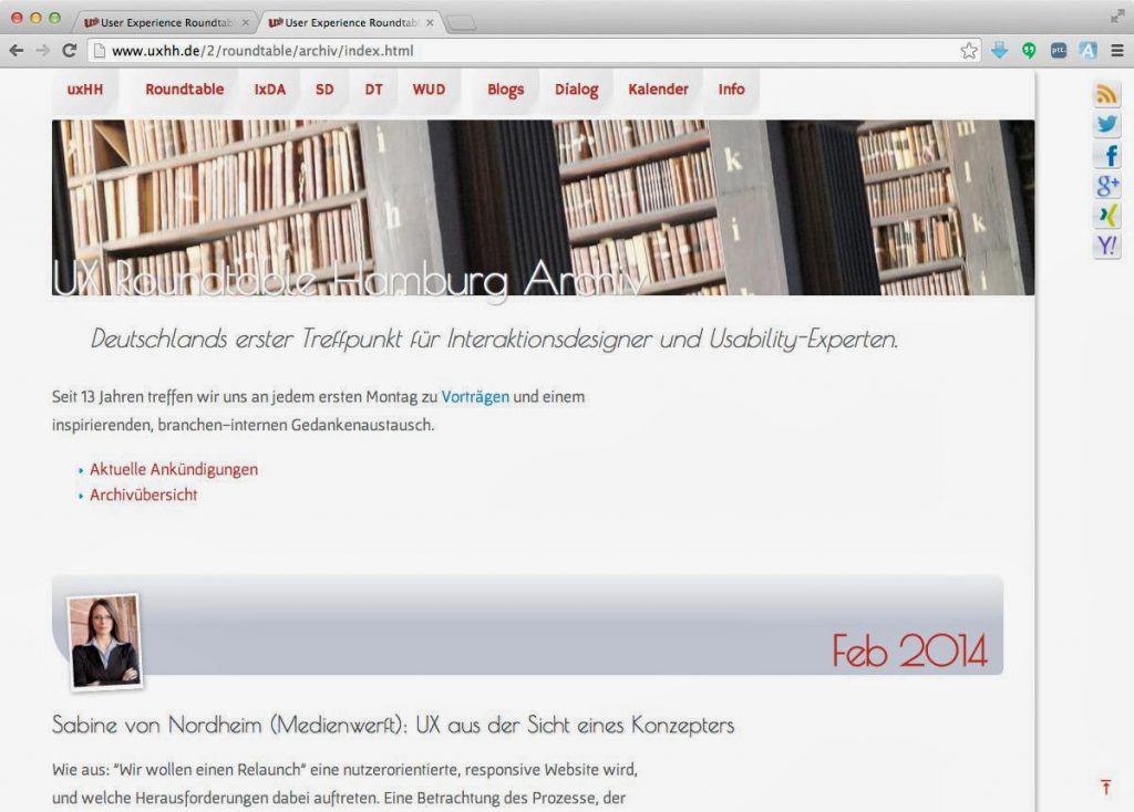
See the two screenshots before and after to get an idea of the changes; i.e. new and larger fonts improve the legibility and character of the site, more white space for a better balance between text and background and a less “bloggy” appearance.
enjoy
–Matthias

