Video unavailable

You probably know this error message from youtube:

youtube message: video unavailable

youtube: Video unavailable

It is the plain and honest message that some videos have been switched off for the audience. Nothing more. And that poses a nasty user experience issue if you consider that UX is the sum of the stimuli before, during and after the use of a product or service. In this specific case I hadn’t even finish watching the recording of an online conference! ––– What does it mean for the UX?? It is a dead end. There is no link available to the profile to follow up with the event organizers or to subscribe or to become a loyal and paying customer.

There is no happy end to this story. I just wanted to share the UX issue with you.

Reeperbahn Festival Conference Highlights

The Reeperbahn Festival Conference 2016 offers (at least) 3 intriguing sessions. They cover the design space between the virtual and the real world. So, if you attend the festival, don’t miss_

Fascination – The State of VR
Prof. Dr. Frank Steinicke, Uni Hamburg ~ /a well-knows speaker at RSE15

Space Oddity – VR & Arts
w/ Toby Coffey of the National Theatre in London

Smart Cities: How Tech Connects Citizens To Solutions

BTW Some photos from RBFC/NEXT15

Interaction 12 – Critique

I’ve summarized my highlights of Interaction 12 already on this blog: Day 1 / Day 2 / Day 3

And there are many more, hidden between the tracks. It is an open secret that the interesting stuff happens in the breaks. Meet and greet with long-time-not-seen’s, meeting virtual friends for the first time in RL, and getting in touch with other interaction designers around the world. To that extend, IxD12 was very good.

But I want to bring some light to the dark corners as well. The opening party took place at the Trinity College in the center of Dublin. A wonderful location. I’ve never been so close to the Book of Kells, but this is another story. – What do you expect from a welcome party? To be welcomed. To say Hello to friends. To talk about the first day of workshops. etc. But you I do not expect a long series of presentations on the first evening already. This was an unfortunate attempt to pick up speed and get us me into the mood for the upcoming three days. Have just a party, or do a Pecha Kuchawhen the audience is I am open to pay attention. All of the presenters would have deserved a better setting.

My second point of crit concerns the main three days of the event: It was a professional conference. Hugh? Yes, for my taste it was too slick. After all those years we are still a young profession. And that could have been better represented with a little more spontaneity, or unconference feeling. For some time I want to write about the idea of a conference experience. You can design conferences much like you can do with tools and software. Just imagine that your app runs for three days (in fact it runs much longer if you include the pre- and post-conference activities, and the twitter stream is still active with all the redux events) and that you have 700 simultaneous users. Live. It is much more like theater or circus.
Then, why do you let the Conference Center choose the music between the talks? Why do you not have some interactive game or art installations during the breaks? Why don’t you encourage (more) Q&A? The audience felt rather tired or uninspired to me. No debates at all. Hey, we do not meet that often. What was going on? Where is the energy in our field?

I should mention –my third point– that I gave up during the 10 minutes short talk sessions. I understand the idea that you want to give as much air time to as many presenters as possible. But the pulsing of 10 minutes talk – 5 minutes nothing or switching between sessions – 10 minutes high – 5 minutes low – etc. was not in synch with my bio-rhythm of attention. Now I would have appreciated the fast paced short talks from the opening party, w/o the 5 minutes breaks of course.

Dear Organizers,
please take my opinion as constructive feedback. I’ve been in your role a few times before. You’ve done a tremendous job to get all this together. But maybe future or other conferences can benefit from my impressions.

cheers, and memorizing the highlights of IxD12 once again.

Interaction 12 in Dublin – Highlights of Day 3

Dublin, Feb-4, 2012. The forth day of Interaction 12  –  actually the third day with a regular conference program in the Conference Center Dublin. BTW_ The CCD reminds me of a database drum, much like the architecture at Oracle’s headquarters in Redwood, CA, just a little bit tilted.

Congress Center Dublin //image by ericthebell

Interaction’s workshops were held on Wednesday, which I did not attend because I conducted “my own” VDI workshops with my engineering colleagues at Oracle in Dublin.

Biomimic Infographic

The most beautiful presentation – both visual and by content – was given by Pete Denman. Pete argued that typical business charts only express very simplified aspects of data sets. To demonstrate the flaws of pie-charts he compared the famous illustration of Napoleon’s war against Russia 1812-13, made popular by Edward Tufte, with a typical modern pie-chart: 95% French men fucked, 5% kind of fucked (see slide 5 and 6 below).

Pete found inspiration in nature to better represent huge data sets on screen. He developed an app for iPad to display medical data. The photos on slide 9-14 can only give a faint idea of the beauty of animated flowers of data. Very well done. And hopefully an example that encourages other to go into the same direction as well.

In anticipation of the conference, core77’s interview with Pete.

Restoring a Sense of Wonder

Too slow to be really good was Michael Smyth’ Critical Design: Restoring a Sense of Wonder in Interaction Design. He presented a series of examples how design and (street) art and urban installations shift the perspective of the observer. Indeed, yet another reference to McLuhan. I liked most the project digitalAntiques (slides 20-22) where antique statues were projected on the walls of Split during the night.

Rage Against the Machines

The closing keynote by Genevieve Bell was an entertaining Rage Against the Machines – Designing our futures with computing. She joined Intel in 1998 with a fresh PhD in anthropology. Her boss told her to do research for Intel on two questions:

  1. Women – half of the population on earth!
  2. ROW – rest of world – in the sense of “everything outside of the USA”!

Well, others complain about more restrictive research agendas… As said, a very amusing talk.

She continued to provide an short overview on the history of mechanical automata, like the Digesting Duck by Jacques de Vaucanson (1739) and the Mechanical Turk by Freiherr von Kempelen, that eventually lead to a meetup of generations between Furby and Siri:

However,
Mrs. Bell lost me when she indicated that it was Joe Weizenbaum’s intention to pass the Turing Test with his Doctor Script for Eliza. In my opinion it is irritating to bend history just to make it fit into a story line. When such things happen, I start to mistrust other facts and conclusions drawn by the presenter as well. A missed opportunity for a good closing keynote at Interaction 12 in Dublin.

webcast of Genevieve Bell’s presentation

>> Ciara Taylor’s summary at core77

Interaction 12 in Dublin – Highlights of Day 2

Friday, the second day of Interaction 12 in Dublin. US folks were suffering under jet lags – I had a little hang-over. Did I mention that the conference took place in Dublin? Between 750 and 800 people attended the fifth interaction conference, the first one in Europe. IxDA itself started in 2003 as a mailing list after Tog has pointed out the enemy: Us. Since then IxDA grew as a nonprofit organization to several thousands of people; 28,000 on IxDA discuss35,000 on LinkedIn. But now back to Friday_

Sketching sometimes involves coding

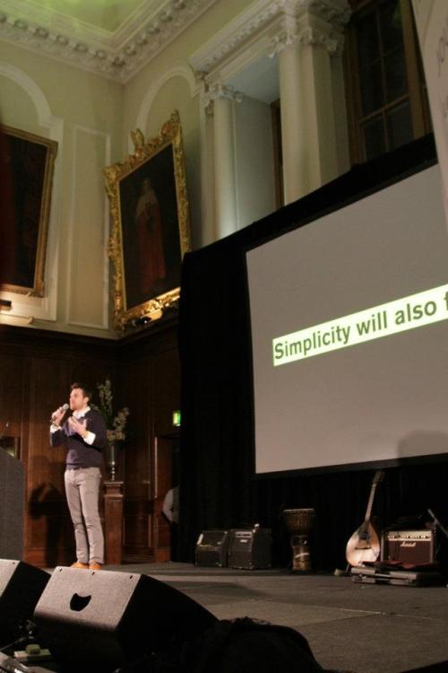
Exploring, Sketching and Other Designerly Ways of Working was the keynote by Jonas Löwgren. If you know Bill Buxton and his book Sketching User Experiences – Getting The Design Right and The Right Design you are already familiar with the idea that sketches are not necessarily limited to pencil on paper. Jonas presented several examples that involve – drum roll – coding! Sometimes story boarding, wireframing, and mockups are not sufficient to explore the user experience of a new product, site, or service. Pinpoint is a design study of an interactive visualization to find people with related interests in large organizations (ACM 2010). Jonas and his team developed several iterations until the crowd moves in a natural way. You can also call this approach prototyping, and then consider prototyping one way of sketching. Voilà.

Pinpoint demonstrator video

I just wonder how many people can be visualized before the screen gets too crowded.

Another example. Mediated Body is an acoustic device that senses the aura (vicinity) of human bodies and translates it into sound – same principle as the Theremin. Now, show me how this experience can be predicted without building and using the thing.

Mediated Body /video

webcast of Jonas Löwgren’s presentation

Understanding Us

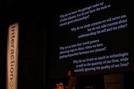
…reminds me of Understanding Media by Marshall McLuhan. Big shoes to fill. Dirk Knemeyer chose this title for his passionate talk about unsolved issues between people.

 /more photos

Dirk argued for more human and psychological properties in technology (instead of abandoning technical tools at all, and going to the park to play with your kids. Well the truth and future should be somewhere in between.) Starting from C.G. Jung, he presented several psychological models, and built the path to a social web that takes individual mental strength and weaknesses into account. I hope a webcast will be available soon to re-listen to his considerations. Until then, the slides must do.

Sculpture

I love listening to talks that open a new point of view. Rachel Bolton-Nasir used her passion for skulpture as a design lens, to better understand design. And she discussed the dimensions of form / multiple viewpoints / physical parts / bodily empathy / multi-sensory and context for zipcar.

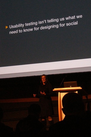
Usability Testing does not test for Social

Dana Chisnell made the point that the artificial situation of usability testing often neglects the social context. In her example a usability test should evaluate the design of a site to calculate your rent, and to choose between several options. The participant started to cry because she never does such decisions without asking her dad, but her dad recently passed away. Very often the context is larger than the space between the user and the screen.
Dana gave another example, the failure of Google buzz. Despite the fact that Google has used and tested buzz internally for quite some time, the product was a failure. Testing does not help, if your test group does not represent the user base.

And the winner is…

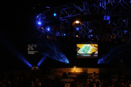
For the first time IxDA run the Interaction Awards. This Friday night was the impressive ceremony to announce the winners. Several of the finalists and, of course, the winning projects are presented at Interaction Awards Winners 2012.

Interaction 12 in Dublin – Highlights of Day 1

Exactly a week ago, Interaction 12 was kicked off by the mayor of Dublin. I mean the real mayor rather than the one in 4square. He talked about (sub)urban planning and the public bicycle system in Dublin. He was proud to say that a minor change in the interaction design prevented the theft of many bikes. Other than Paris (they lost hundreds), the pole to get a bike is not prominently highlighted in a way that everybody can take the bike as soon as it unlocks. Just two bikes were stolen and both were returned. Clever briefing, or clever mayor – you decide.

Disrupt

After a while I decided to like the opening keynote by Luke Williams. He tackled the general problem of large companies (hey, this should apply to Oracle as well) that they are obviously unable to create new disruptive markets. If they have a business, a successful business, they focus to exploit it as long as possible. But they neglect to go for niche markets, because the dollars are earned in the main stream. Blockbuster Video ignored Netflix. Kodak ignored digital photography. Nokia ignored Apple and Google in the mobile phone market…

Luke offered the idea to do exactly the opposite of the (current) cliché. Why –the heck– are socks sold in pairs? – My mind kicked in and said, “yeah, if I have a hole if a friend has a hole in his sock he can buy just one sock to complete the pair. Makes sense!” But Luke continued to explain that a company built a business on selling socks in sets of three. And none of them has the same pattern! Kids and girls in specific love the brand.

a few more images 

Interview with Luke Williams, core77

webcast of Luke Williams’ presentation

Videos shown by Luke_

National Leprechaun Museum

The disruptive highlight of the day was Tom O’Rehilly’s talk on Imagination and Identity. Tom started his career with selling luxury furniture, until he realized that he was in fact selling experiences. Welcome Tom, to the field of user experience and interaction design. I do not remember why he told the story of Brasil, an island on the shores of Ireland that only appeared every 7 years. But I do remember his stories about the Leprechaun, a little Irish wizard or dwarf that is very hard to track. Tom runs the National Leprechaun Museum in Dublin, which is called a museum for the lack of a better name. It is an experience that turns the visitors into little Leprechauns themselves. You enter through a wooden tunnel that changes its diameter while you walk though. It must be a spectacular effect like Alice through the rabbit’s hole.

/photo cc by The National Leprechaun Museum

What If…

The second keynote of the day should be mentioned: What If… crafting design speculations by Anthony Dunne.

/more photos

I am happy that the webcast of Anthony Dunne’s presentation is available.

In addition to the summary at core77, I will try to add more video links for the projects_

Related_