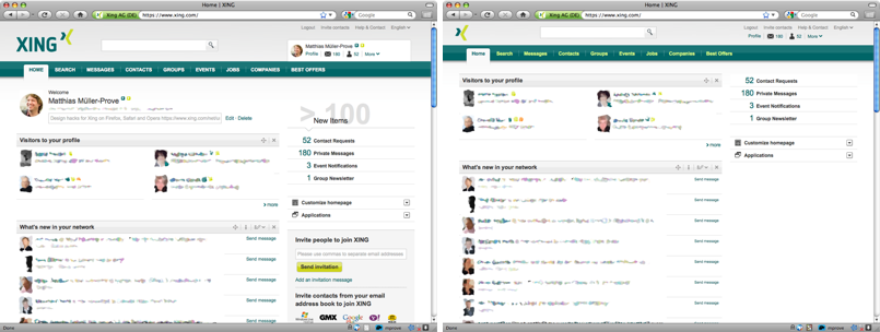
Xing’s recent relaunch introduced a couple of new features and design updates. I definitely appreciate that Xing continues to develop and improve my main networking platform. I would like to share my design hacks to get an even better usability with less clutter and more space for the content – In my example 1/3 more space for the content area.
