
Ivan talked about leadership at Sun’s SEED summit 2006. The remarkable event has been captured on tape and is now online.
Ivan Sutherland on Leadership, Sun 2006 from mprove on Vimeo.
Human Computer Interaction Design
Ivan talked about leadership at Sun’s SEED summit 2006. The remarkable event has been captured on tape and is now online.
Ivan Sutherland on Leadership, Sun 2006 from mprove on Vimeo.
 Powerpoint. Macht und Einfluss eines Präsentationsprogramms. Herausgegeben von Claus Pias und Wolfgang Coy im Fischer Verlag, 2009
This article is about reducing complexity with a knife, scissors, and some tape. These tools already indicate that I am talking about real life! Well, in fact you can cut all the wires of your power adaptors to simplify your life, but I do not recommending this right now. The problem at hand is a TV remote — I can hear your aarghs! Too many remote controls with too many functions, too tiny buttons, too easy to get lost, confusing labels and to sum it up: not suited to the task. My user population is an 80-yrs old lady with a telly hooked up to the cable; no special equipment like VCR, DVD, AUX 1-3 or SAT. Not to mention HD recorders, or TiVO with timeshift functionality. In my opinion it is even difficult for an educated engineer to use any remote control properly, but at 80 years you come from a totally different background to say the least, and your mental abilities are no longer at 100%. Usage errors are frequent — and the concept of Undo or Home is not available.
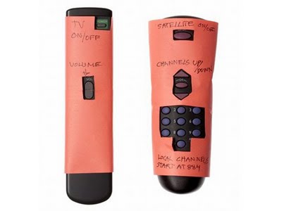
As said, my approach reduces the likelihood of user errors by making dangerous actions impossible to trigger:
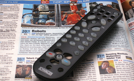
http://www.23hq.com/mprove/photo/4903842
I find my design also superior to the competition because in terms of robustness you cannot remove the paper shield by accident.
 (also http://om.ly/Ipvj)
Other special remote controls aim to address a limited eyesight of the user by making everything larger:
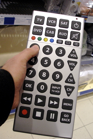
http://www.23hq.com/mprove/photo/4903784
They shouldn’t have stopped here. Clear wording is preferred. But this is no news if you are familiar with accessibility guidelines. On the other hand, this is the first remote that offers a function to call a taxi (CAB) — I call that a unique selling point!
I suppose different shapes of buttons would also be a good idea, because haptic feedback becomes more important if you cannot see so well anymore; or if it’s quite dark in your living room with the home entertainment system. Though in the example above, channel and volume controls are too similar to get used to without taking a look all the time.
[originally published as a User Experience Forum Newsletter #28 | Join Xing]

service design is interactive design meets industrial design meets advertising meets interior design meets graphic design meets sequential art. An interview with Pater Fossick by Paula Wallace.
/via Matthias Schrader
Insights On Innovation. Apple thinks good design is a present. Pixel-perfect mockups are critical. 10 to 3 to 1. Paired design meetings. Brainstorm meeting. Production meeting. Pony meetings.
What else does Apple do differently? 1. Apple does not do market research. 2. Apple has a very small team who designs their major products. 3. Apple owns their entire system. 4. Apple focuses on a select group of products. 5. Apple has a maniacal focus on perfection.
So is it possible for you to innovate like Apple? You need a leader who prioritizes new product innovation. You need to focus. You need the right people, and you need to reward them.
Complete article at: You Can’t Innovate Like Apple — By Alain Breillatt
Bill Buxton and Gary Hustwit – director of Objectified – met for a 17′ interview at mix09via http://visitmix.com/News/Buxton-Hustwit
When Peter approached me a few weeks ago to work on the UI design for the next release of Sweet, I had just started on twitter in order to understand what all the fuzz is about. Well, I cannot say I get it, but at least I got some interesting links that I had missed otherwise.
Now Sweet is our internal microblogging service, based on open source laconi.ca. You can try out laconica at identi.ca or take a look at the before state_

It is not possible to significantly change a project in mid air – but this is exactly what I did by tweaking the CSS and a few images to create a pleasant and inviting design for Sweet. Note the logo (done with creatr.cc), the color scheme, the layout, the text counter, the tabs, the font changes, and the tag cloud in the after image. BTW_ the bird in the tree indicates that a tweet is also visible to the public on twitter.

Paying attention to the ‘design details’ can even improve the usability of such a project. A professional design increases the perceived quality and therewith the user experience. Since the relaunch we have more users and we even figured out that there was another installation of laconica running inside Sun — they are now planing the migration to Sweet.
All this took me less than a week. I learned a lot about dirty CSS hacks, and got in touch with 2 nice colleagues at Sun whom I never met in person. Peter was a kind of project lead, and Olof the engineer behind the curtain. And guess what, our main communication tool was… Sweet!
Dear OOo guys,
don’t know if you have noticed yet, but the update notification mechanism does not work properly. It continuously informs me on new updates – while in fact there are none available. Furthermore, the menu bar icon never goes away.
I assume this is not the intended behaviour. I hope you agree and fix this. Issue filed: 102098
PS_ deleting the file user/LibraryApplication Support/OpenOffice.org/3/user/registry/data/org/openoffice//Office/Jobs.xcu solves the problem.
The Information Architecture Konferenz 2009 took place in Hamburg last weekend. Here are some links…
Beat Signer on PowerPoint Multimedia Presentations in Computer Science Education: What Do Users Need? /30′ video at TU Graz
Structured interviews with 9 faculty members of ETH Zurich lead to the following desired features
Idea for PaperPoint: Use Anoto pen on hand-out of presentation to control the slide show. Very nice!
Publication: PaperPoint: a paper-based presentation and interactive paper prototyping tool. In: Tangible and embedded interaction. Proceedings of the 1st international conference on Tangible and embedded interaction