Knowledge Navigator Implications

Between 1987 and 1988 Apple has created a couple of vision videos under the common research theme Knowledge Navigator. Of course, Knowledge Navigator and Future Shock are most famous; but there are about 10 others short clips which illustrate additional concepts. Note that these are created in the pre-Web and pre-tablet era.

Below is a video that features Steve Wozniak, Diane Ravich (then director of Encyclopædia Britannica <sic!>), Alan Kay and the authors Ray Bradbury and Alvin Toffler. They are dreaming about the future – our present. Although the technology today seems capable to deliver on this vision, I suppose we have some work left to do you adjust our tools in a way to really support it.

Topics: computers as simulation tools, education, agents, voice user interfaces, automated translation, hypermedia

Knowledge Navigator Implications, Apple 1988 at YouTube

Innovation durch Inklusion

Thorsten Wilhelm  hatte folgende Gäste zum Panel Innovation durch Inklusion eingeladen: Brigitte Borneman, Paul Pagel, Dr. Kirsten Bergmann, Matthias MProve und Jörg Morsbach.  Die Session kann nun im Kanal von eparo nachgeschaut werden:

à propos

Hamburg Inklusive

Fahne am Hamburger Rathaus: Hamburg wird inklusiv

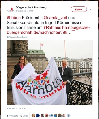
Bürgerschaftspräsidentin Carola Veit und Senatskoordinatorin Ingrid Körner hissen Inklusionsfahne am Rathaus /via

Jüngst wurde auf dem Hamburger Rathaus eine Fahne für die Initiative Zeit für Inklusion gehisst. Das ist natürlich ein gutes Omen für den World Usability Day am 9.11. in Hamburg, der in diesem Jahr unter dem Motto Inklusion durch User Experience steht.

Soweit ist das sicherlich ein angenehmer Zufall; man sollte aber nicht zu schnell glauben, dass man das Motto des WUD verstanden hätte. Nach ein paar Irrungen und Wirrungen steht nun auf der Seite der germanupa (e.V.):

Gut konzipierte Systeme und Dienste bieten ein positives Nutzungserlebnis für alle Arten von Menschen, unabhängig von ihrem Hintergrund, ihrer Ausbildung oder ihrer aktuellen Situation. Jeder hat unterschiedliche Stärken und Schwächen, die ihn nicht von der Teilnahme am beruflichen oder sozialen Leben über die Kommunikationstechnik ausschließen sollten. Werkzeuge und Technologien, die Gemeinsamkeiten betonen, um das Potenzial aller Menschen zu erschließen, schaffen Bedingungen, die Menschen dazu bringen, ihr bestes Selbst zu sein. Das Entwerfen von nützlichen Werkzeugen zur Unterstützung von Menschen wird bei allem, was wir tun, zu besseren Ergebnissen führen.

(Dank an Holger Fischer, der meinen Text für den WUD in USA aus dem Englischen übersetzt hat.)

Ich begreife Inclusion (mit c im Gegensatz zum deutschen Begriff, der eher den Schulsektor betrifft) als Grundwert für jeden erfolgreichen Interaktionsdesigner. Mit Empathie nehmen wir die technische und soziale Welt mit den Augen des Nutzers wahr, um für ihn Lösungen zu konzipieren. Je spezieller die Personas charakterisiert sind und je genauer die Nutzungsszenarien vorgegeben sind, um so besser kann auch die Usability eines Produkts oder Services gestaltet werden. Allerdings besteht dabei die Gefahr, dass man Einsatzgebiete und Personen abseits der Hauptkontexte ausschließt, da für diese Situationen das Tool nicht mehr einsetzbar ist. Das ist Exklusion durch UX Design. Betrachtet man die Szenarien und Personas etwas weniger starr, dann können auch Spezialanwendungen noch sinnvoll in anderen Situationen und von anderen Anwendern eingesetzt werden. Bedenkt man variierende Parameter, dann hilft das nicht nur den direkten Kunden, sondern die Lösung wird flexibler, langlebiger und erfolgreicher.

Accessibility (A11y), Internationalization (I18n) und Responsive Desgn sind Produkteigenschaften, für die Guidelines und gesetzliche Regelungen existieren (e.g. 508 in USA). Inclusion (mit c) sehe ich als Erweiterung dieser Ideen.

Remote TV A11Y

This article is about reducing complexity with a knife, scissors, and some tape. These tools already indicate that I am talking about real life! Well, in fact you can cut all the wires of your power adaptors to simplify your life, but I do not recommending this right now. The problem at hand is a TV remote — I can hear your aarghs! Too many remote controls with too many functions, too tiny buttons, too easy to get lost, confusing labels and to sum it up: not suited to the task. My user population is an 80-yrs old lady with a telly hooked up to the cable; no special equipment like VCR, DVD, AUX 1-3 or SAT. Not to mention HD recorders, or TiVO with timeshift functionality. In my opinion it is even difficult for an educated engineer to use any remote control properly, but at 80 years you come from a totally different background to say the least, and your mental abilities are no longer at 100%. Usage errors are frequent — and the concept of Undo or Home is not available.
As said, my approach reduces the likelihood of user errors by making dangerous actions impossible to trigger:

http://www.23hq.com/mprove/photo/4903842
I find my design also superior to the competition because in terms of robustness you cannot remove the paper shield by accident.
(also http://om.ly/Ipvj)

Other special remote controls aim to address a limited eyesight of the user by making everything larger:

http://www.23hq.com/mprove/photo/4903784
They shouldn’t have stopped here. Clear wording is preferred. But this is no news if you are familiar with accessibility guidelines. On the other hand, this is the first remote that offers a function to call a taxi (CAB) — I call that a unique selling point!
I suppose different shapes of buttons would also be a good idea, because haptic feedback becomes more important if you cannot see so well anymore; or if it’s quite dark in your living room with the home entertainment system. Though in the example above, channel and volume controls are too similar to get used to without taking a look all the time.
[originally published as a User Experience Forum Newsletter #28 | Join Xing]