If your only tool is a CSS hammer, the entire world wide web looks like a nail.
This time I’ve implemented a couple of CSS design improvements for protonet’s user interface. The average user experience of the sample user group went up from sort-of-ok to relieved and delighted.
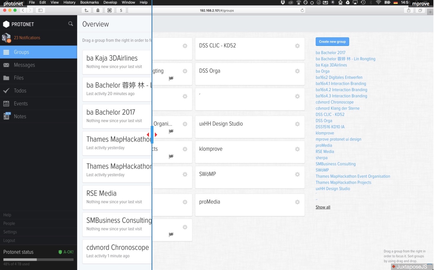
The motivation of all the changes is pure usability design: better layout, contrast, color scheme, legibility, control element recognition, focus on notifications, less noise, less scrolling, semantic colours for the calendar, and much more. The page protonet design hacks summarises and explains the changes. I’ve also played a bit with JuxtaposeJS to provide before&after comparison.
There is more in the pipeline regarding protonet – other enhancements of my design lab apply to the twitter stream and google’s search experience. Let me know if you are interested in the comments below.