This article is about reducing complexity with a knife, scissors, and some tape. These tools already indicate that I am talking about real life! Well, in fact you can cut all the wires of your power adaptors to simplify your life, but I do not recommending this right now. The problem at hand is a TV remote — I can hear your aarghs! Too many remote controls with too many functions, too tiny buttons, too easy to get lost, confusing labels and to sum it up: not suited to the task. My user population is an 80-yrs old lady with a telly hooked up to the cable; no special equipment like VCR, DVD, AUX 1-3 or SAT. Not to mention HD recorders, or TiVO with timeshift functionality. In my opinion it is even difficult for an educated engineer to use any remote control properly, but at 80 years you come from a totally different background to say the least, and your mental abilities are no longer at 100%. Usage errors are frequent — and the concept of Undo or Home is not available.
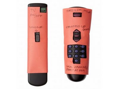
As said, my approach reduces the likelihood of user errors by making dangerous actions impossible to trigger:

http://www.23hq.com/mprove/photo/4903842
I find my design also superior to the competition because in terms of robustness you cannot remove the paper shield by accident.
 (also http://om.ly/Ipvj)
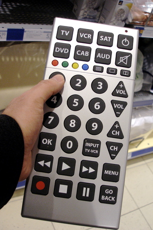
Other special remote controls aim to address a limited eyesight of the user by making everything larger:

http://www.23hq.com/mprove/photo/4903784
They shouldn’t have stopped here. Clear wording is preferred. But this is no news if you are familiar with accessibility guidelines. On the other hand, this is the first remote that offers a function to call a taxi (CAB) — I call that a unique selling point!
I suppose different shapes of buttons would also be a good idea, because haptic feedback becomes more important if you cannot see so well anymore; or if it’s quite dark in your living room with the home entertainment system. Though in the example above, channel and volume controls are too similar to get used to without taking a look all the time.
[originally published as a User Experience Forum Newsletter #28 | Join Xing]