Xing’s recent relaunch introduced a couple of new features and design updates. I definitely appreciate that Xing continues to develop and improve my main networking platform. I would like to share my design hacks to get an even better usability with less clutter and more space for the content – In my example 1/3 more space for the content area.
Tag: xing
Xing’s brokn buttons
Firefox 2 on Windows, default font size – ok:
Firefox 2 on Windows, increased font size — the Find buttons show some strange artifacts:
Firefox 2 on Mac, default font size – ok: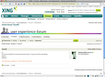
Firefox 2 on Mac, increased font size — the Find buttons show the same strange artifacts as on Windows: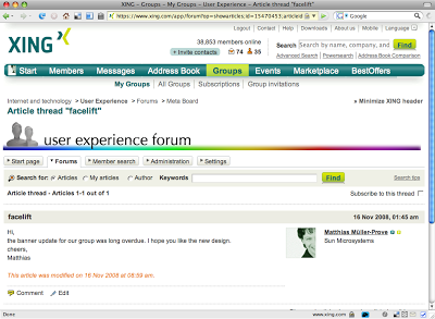
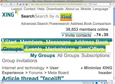
Firefox 2 on Mac, incredible increased font size — aha! This is how the UI is implemented. And I suppose Xing can also do better regarding accessibility: