Window Cooling at Xerox Star

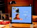
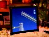
// reblogged via interaction-design.org on fb So this morning I was curious about the origin of what is often referred to as the hamburger icon. Spent a few minutes digging around and found this video from the Xerox Star. Turns out that Norm Cox is who designed the interface for this system. I emailed Norm and asked who designed the hamburger icon? Here’s his response:

You’ve done your homework and found the right guy. I designed that symbol many years ago as a "container" for contextual menu choices. It would be somewhat equivalent to the context menu we use today when clicking over objects with the right mouse button. Its graphic design was meant to be very "road sign" simple, functionally memorable, and mimic the look of the resulting displayed menu list. With so few pixels to work with, it had to be very distinct, yet simple. I think we only had 16×16 pixels to render the image. (or possibly 13×13… can’t remember exactly). Interesting inside joke… we used to tell potential users that the image was an "air vent" to keep the window cool. It usually got a chuckle, and made the mark much more memorable. It’s been nice to see that so many of our designs from those early pioneering years have stood the test of time and become ubiquitous symbols in our UI’s. Feel free to share the short story. I have many more design related stories from my days at Xerox PARC during the birth of graphical UI’s, and subsequent 30+ years consulting. I think it’s important to share the past with designers today to help them understand the philosophies, constraints, considerations and inspirations that got us to where we are today. I only ask for proper attribution when you post something from me. (I like people to know that they can get in touch with me for more design tales!) Kind regards Norm

all-the-widgets from Brad Myers on Vimeo.

Deeper Cosmology – Deeper Documents

Ted Nelson 2013 - by Frode Hegland, animated by Matthias Mueller-Prove

This is not my planet. And this is not my conference.

– Ted Nelson’s opening words at ACM Hypertext 2001. Once in a while I find it very refreshing to remind myself on potential alternatives and fundamental considerations about the state of technology with respect to the web and our knowledge management tools as such. An ever-trusted source on this is Ted Nelson (bibliography and videos).
More quotes from the talk:

  • I think of the world wide web and XML and cascading style sheets is the ultimate triumph of the typesetter over the author.
  • three fundamental problems today:
    1. hierarchical file structures
    2. simulation of paper
    3. the application prison
  • Software is a branch of movie making.
  • The question is about starting over.

A friend who has attended the conference gave me a CD with the talk. Eventually, I decided to upload the recording to vimeo. Please enjoy:


Ted Nelson at ACM Hypertext 2001 from mprove.

Photo: Ted Nelson 2013 – by Frode Hegland, animated by myself

Starfire

The second video – which I helped to put into the public space – is also from the vision’n’concept department: Starfire by Sun Microsystems 1994.

At CHI ’98 I’ve attended a presentation by Frank Ludolph on Apple Lisa. Frank had also booth duty at the conference where he spread a couple of VHS tapes of Starfire. What marvelous concepts! Multitouch, voice UI, wall-size displays, tablets with motion and orientation sensors, telepresence for video conferences, among many more…
Years later – in 2005 – I asked Tog for a digital copy. Of course he had one – but no permission for sharing. By chance I was working for Sun at the time and got approval from Sun’s VP Juan Carlos Soto to release the video. So please enjoy_

Starfire Director’s Cut, Sun 1994

More References

Future Shock

There are a couple videos in the public domain space now where I take credit to have preserved them from fading away. The first is Future Shock by Apple 1988.
Future Shock: gesturesFuture Shock: gesturesFuture Shock: glasses with subtitlesFuture Shock: e-learning

I saw it first on an Apple promo CD while working at BBDO in the early 1990s. It was a tiny QuickTime movie. But it made a huge impression on me. Gesture and voice interaction, as well as an early predecessor concept of google glass – didn’t know that at the time 😉

A decade later I stumbled upon the CD at the library of the IZHD, made a backup copy, and uploaded it to my site. From there it went to Mac Essentials’ magazine site, and eventually to youtube.

The poor quality is still due to the original QT version. I would be very interested to get a hires version…


Future Shock, Apple 1988 from mprove.

uxHH facelift

I was in the mood to update the design of uxHH.de

See the two screenshots before and after to get an idea of the changes; i.e. new and larger fonts improve the legibility and character of the site, more white space for a better balance between text and background and a less “bloggy” appearance.


enjoy
Matthias

Arrow Key Navigation


I was curious to figure out how e.g. flickr or facebook have implemented the behavior to move to the next image by simply pressing the right arrow key. Well, I do not really know down to the bleeding fingers, but here is my solution to move to the next page in a sequence of pages:

The mediathek of the Raum Schiff Erde offers a chronological tour for all sessions ever. The link to proceed to the next page in sequence has the attribute rel=”next”.

Then the head section needs a short jQuery/JavaScript to catch the right arrow key w/o the Ctrl/Cmd modifier pressed, identify the first link with the relation ‘next’ and trigger the link:

$(document).keydown(function(e) {
  var arrow = {left: 37, up: 38, right: 39, down: 40 };
  switch(e.which) {
    case arrow.right:
      if (e.metaKey) {return;}
      document.location.href = $(“a[rel=’next’]”)[0].href;
      break;
    default: return;
    }
  e.preventDefault();
  });

Have a look at the source code of the example above how to include the jQuery library.

I want to finish this little tutorial by mentioning that I did not invent the link relationships (‘next’ and ‘prev’) – but usually browsers do not make any use of this kind of semantic information. Heck, why not?! It would be cool if all web pagination would support this semantic behavior. Amen.

PS: A few more examples where I have applied the script:

// Photo cc by Craig

Apple does not do Design Thinking

A quick comparison between Design Thinking Principles and Apple reveals…

Design Thinking Apple
Fail early and often …but just internally.
Leave titles at the door Do not come in if you do not contribute to the meeting.
There are no good ideas Either it sucks or it is insanely great.
Do! Don’t talk.
Build on ideas of others Yes, but turn them into something insanely great.
The quantity is it. The quality is it.
Avoid criticism. “This is shit”
Stay focussed. Stay hungry.
Dare to be wild! Stay foolish.
Think human centered. Think details oriented.
Be visual. look and feel contributes to the user experience
Let’s have Fun. Never take the same elevator with Steve. You do not have a job anymore.

q.e.d. Apple does not do Design Thinking. Nonetheless, Apple products are still best of breed.

à propos

[Update 2-Nov-2022]  I am not saying that either way is better or worse than the other. I just like to fight dogmatism (in any area). Take your team – build your team in a way that is best for your users, your customers (not necessary the same as your users) and your business. Enjoy your work and the stuff that you are building for the sake of all.

x-Experience am 30.5.13 im Informatikum

Nach meiner spontanen Improvisation unter freiem Himmel zum UXCamp 12 gibt es nun eine Fassung für das MCI Kolloquium des Fachbereichs Informatik der Uni Hamburg am kommenden Donnerstag.


Abstract. Der Begriff der User Experience hat sich nach seiner erstmaligen Verwendung bei Apple Computer gegen Ende der 1980er Jahre in unserer Disziplin etabliert. Allerdings ist nicht zu übersehen, dass derzeit weitere Begriffe das Nutzererlebnis des Anwenders zu beschreiben suchen, wie zum Beispiel Customer Experience, Community Experience, Brand Experience bis hin zu Tchibos Slogan, „Jede Woche eine neue Welt“ / „A new experience every week“.

Was sind die gemeinsamen Elemente all dieser Bindestrich-Erlebniswelten? Passt die ISO Definition der User Experience auf diese Szenarien? Oder welche Ideen lassen sich aus den Gestaltungsbereichen des Marketings oder der Event-Kultur für die Gestaltung von Systemen und Services übertragen?

Weiter Infos auf der Seite des MCI Kolloquiums.

Update: Slides und Referenzen

Sound Design und Design Thinking


Und gleich noch ein weiterer Mitschnitt im uxHH Radio:  Hans Schüttler berichtete im Januar als Gast bei DT_HH aus seinem Beruf als Musiker und Sound-Designer.

Diesem Event habt Ihr den Impuls zu verdanken, dass das uxHH Radio nun auch mit einem Intro und Outro gesendet wird. Die Tropfen zu Beginn stammen aus One Drop von Helge Krabye. Das Outro ist mit IL Est Parti von Eric Wenger unterlegt.

Aber nun zum Podcast (1:47′)

Dieter Rams im uxHH Radio


Dieter Rams

Dieter Rams war vor einiger Zeit zu Gast im Museum für Kunst und Gewerbe Hamburg. Klaus Klemp moderierte die Veranstaltung an der außer Dieter Rams noch “seine Schüler” Olaf Barski und Andreas Hackbarth teil genommen haben. Sie diskutierten über die Voraussetzungen einer guten Design-Ausbildung, über die große Bedeutung der Anwendungsqualität neuer Produkte und den Mangel an Unternehmerpersönlichkeiten, die bereit seien, in die fundierte Entwicklung von Design zu investieren.

Ich möchte keine Beschwerden zu der Soundqualität hören – die Originalaufzeichnung war dank der Akustik im Saal kaum zu verstehen. Hier nun die spannenden 74 Minuten.